CREATIVE DIRECTION

STAR WARS: GALAXY OF HEROES
Narrative framing that improved the context of mix-and-match squads
Squad-Based Roleplaying Game (Electronic Arts)
CHALLENGE
Because the economy of Star Wars: Galaxy of Heroes relies on hero acquisition and experimenting with squad makeups, the game needed creative framing that made LucasFilm comfortable with players:
Mixing heroes from different Star Wars eras (e.g., Darth Vader from the original trilogy fighting Rey from the sequel trilogy)
Mixing heroes with different alignments (e.g., having a light side Luke Skywalker and a dark side Emperor Palpatine in the same squad)
I also learned through playtesting that players were confused about what their place was within the Star Wars universe, and what their motivation was supposed to be as a person commanding squads full of the “galaxy’s greatest heroes.”

APPROACH + RESULTS
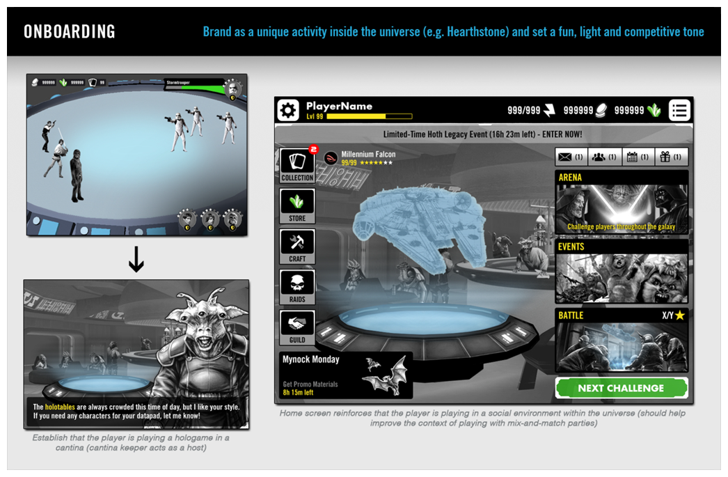
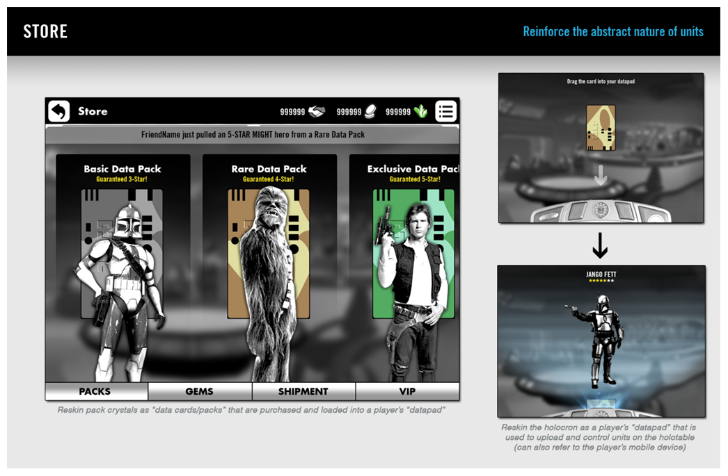
Based on that information, I developed a narrative framing approach where the player would actually be playing a “hologame” inside a cantina, collecting and controlling holographic versions of the characters. This approach:
Improved the context of mix-and-match squads for both LucasFilm and our players, making them both comfortable with non-canon squad makeups.
Reinforced that the player was inside a competitive social environment in the Star Wars universe, giving them a clearer meta goal (i.e., “command the galaxy’s greatest heroes for fame and fortune”).
These narrative framing choices helped improve player motivation and onboarding friction by quickly and clearly establishing the rules of the game world and the player’s role within it.
MAD MEN
Narrative gameplay direction + interaction convention design
Interactive Narrative Game Concept
CHALLENGE
Design goals for this concept focused on creating adaptable cross-platform conventions and crafting a narrative gameplay system that would fit the IP.
APPROACH
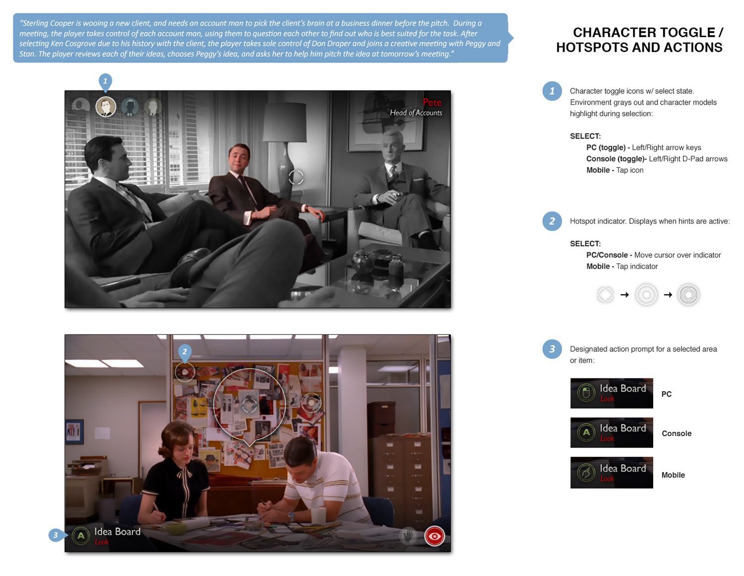
Since Mad Men as an IP is known for its ensemble, interaction ideas revolved around heavy interplay between characters, such as:
“WORKING THE ROOM” w/ MULTIPLE CHARACTERS
I wanted to give the player a goal that required multiple characters to achieve (e.g., winning over a client during a pitch) and allow them to shift between characters at will during certain scenarios. The unique character combinations (i.e., who the player chooses to use, what the chosen characters know, what they say and when they say it) would create dynamic narrative puzzles while allowing multiple fan favorites to be playable without an abundance of story arcs.
MAINTAINING A CHARACTER’S IMAGE
I also wanted to simulate the upkeep of a carefully crafted image by adding hidden, timed character moments that can alter the attitudes and perceptions of anyone watching. Finding and executing these moments could add new actions and dialog options for specific characters based on their reputation.

TEENAGE MUTANT NINJA TURTLES: SPLINTERED FATE
UI style + readability direction
Co-Op Roguelike Game (Super Evil Megacorp)
CHALLENGE
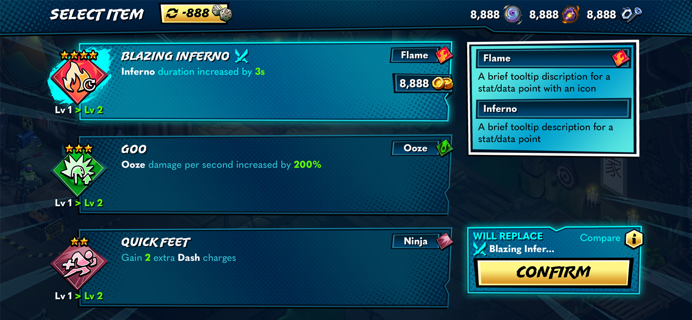
This cross-platform co-op roguelike game required a UI direction that was appealing and accessible.
It needed to leveraged the best practices of Hades (the game’s main comp)
It needed to make adjustments to better serve its IP, audience and target displays (i.e., phone, tablet, and tv/monitor)

APPROACH
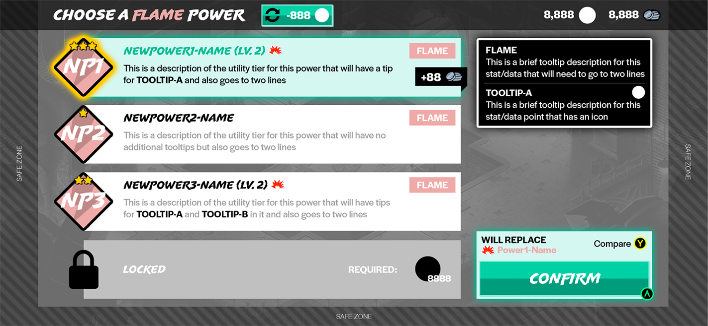
First, I completed designs for the game’s interaction architecture so that all necessary UI elements would be accounted for before beginning work on the art.
Once the team was aligned on the wireframes, I collaborated with our Art Director, Lead UI Artist, and IP partner Paramount to arrive at a direction.
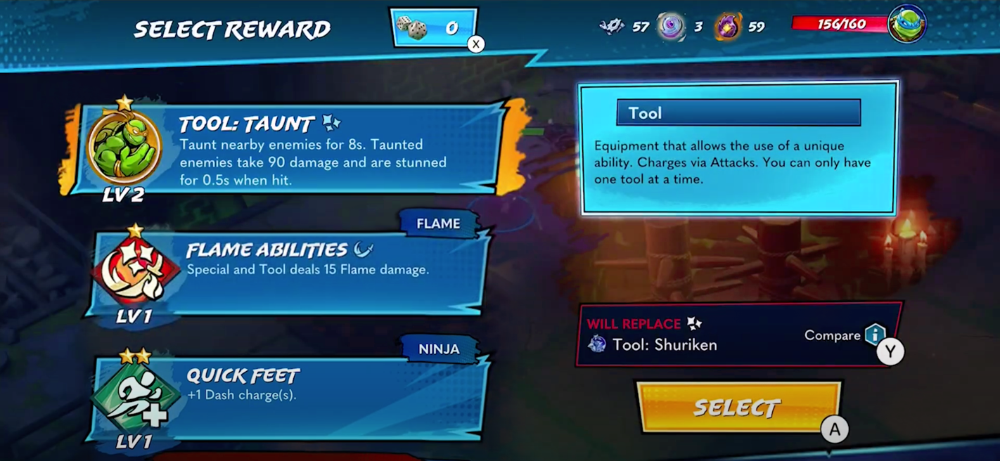
We established a comic book style that walks a line between fun and gritty
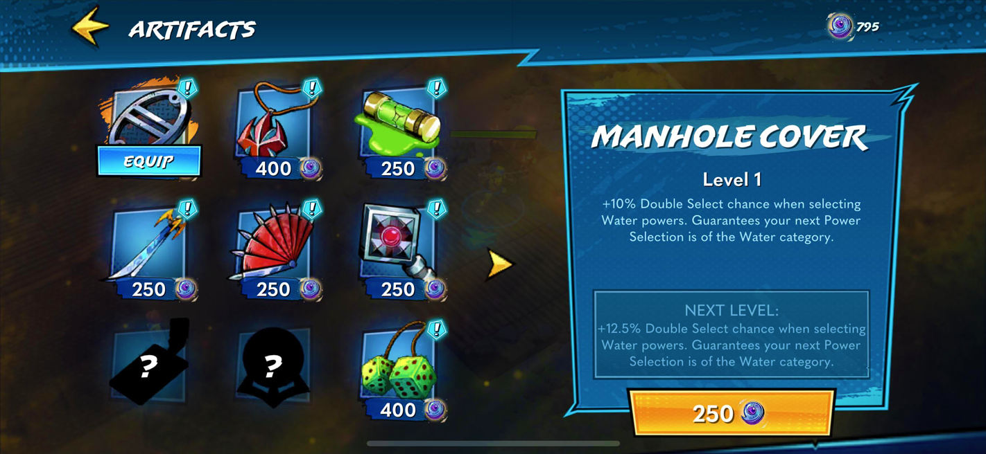
We developed a more comprehensible visual language for key game elements
(e.g., clear, illustrative icons with unique containers for items, a progressive star count for rarity, etc.)
We utilized bright, high contrast colors to enhance overall readability

RESULTS
After some iteration, we succeeded at creating style guidelines that met the diverse needs of each stakeholder while also arriving at a cohesive overall look.
“It’s beautiful. These hard contrasts and the darkness and the lightness coming together to make everything pop, these strong colors and brush strokes of the menu, it’s very appealing.”
- GameXplain
“It's a far more accessible way into roguelikes than many of its contemporaries…”
- Nintendo Life
POST-GAZETTE.COM
Content conception, brand identity + development
Various web products (Pittsburgh Post-Gazette)
CHALLENGE
As the sole designer on the Pittsburgh Post-Gazette’s interactive media team, I was tasked with concepting and developing new types of traffic-generating web content while maintaining the user experience of Post-Gazette.com and its subsidiary products.
APPROACH
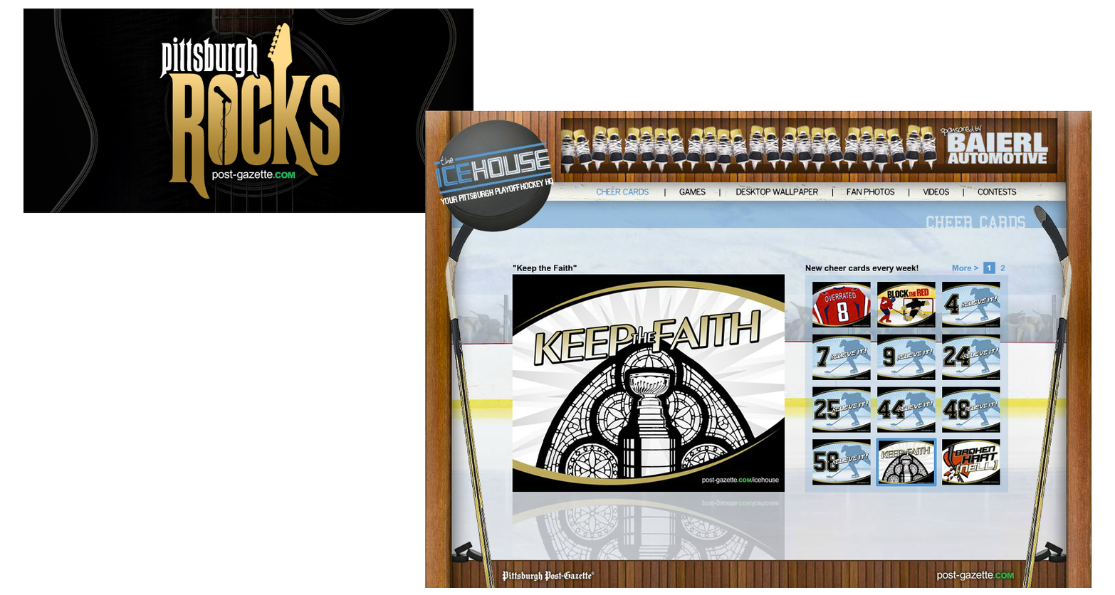
Collaborating closely with Marketing while wearing the hats of both a Media Designer and Project Development Coordinator, I led the creation efforts (e.g. branding, identity and design) and managed the launch and promotion of several award-winning niche sites, games, social media hubs and mobile applications.
RESULTS
These content initiatives helped to maintain Post-Gazette.com’s robust engagement, reinforcing its place as the news organization’s key revenue generator.
